A PR master class from @Walmart

PR folks spend a lot of time cogitating over how to address articles or columns that just aren't quite right.

The New York Times ran a piece on inequality in the workplace that focused heavily on Walmart. The big retailer saw many inaccuracies in the piece — and responded in a novel and masterful way, including posting the response on its blog.

PR pros, here's how it's done. 


On designing an iconic bomb

Legendary icon designer Susan Kare recently gave a great and amusing talk at EG8.

On her icon set for the original Mac:

"I designed this image [unhappy Macintosh] and this bomb because I was told they would never be seen by anyone! So I thought I could be a little irreverent. But unfortunately, that was not the case.

"The programmers truly thought at the time that they would be deeply hidden. I know that right after the Mac shipped we were in our software area and a call came in fielded through Apple and it was a woman who was using MacWrite, and it had crashed, and she was afraid her computer was going to blow up! So, I felt kinda bad!"

The computer didn't explode. But Kare's icons did.

Instead, the bomb icon and the rest of the set took on lives of their own and can be seen all over the world, including in a subway station in Sweden.

Kare later worked at Microsoft, but as far as I know she didn't design the Blue Screen of Death.

Kare's icons are infamous — I have one of Kare's signed happy Macintosh prints in my office. 

Simplicity is evident in Kare's designs. Her advice: "Just enough detail."


May: 2014, Susan Kare walks us through some key points regarding the design of icons and symbols. Kare is an artist and designer and pioneer of pixel art; she created many of the graphical interface elements for the original Apple Macintosh in the 1980s as a key member of the Mac software design team, and continued to work as Creative Director at NeXT for Steve Jobs.

Go read somebody else's blog (it could save your life)

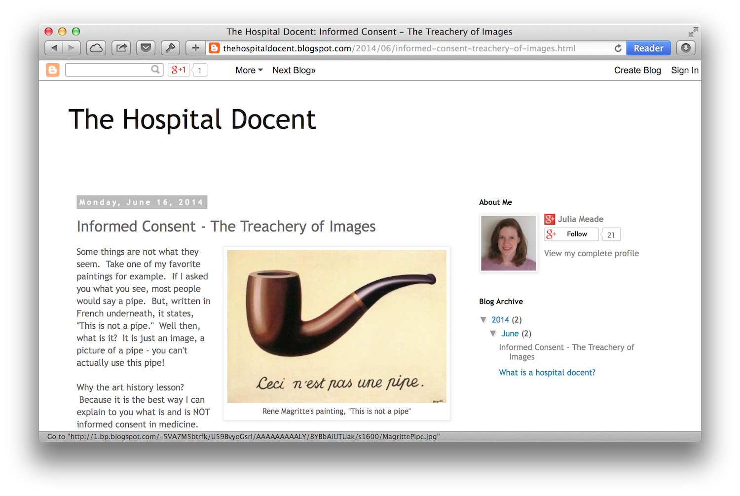
That somebody else is Julia Meade, a resident who attended the 2014 Telluride Patient Safety Resident Physician Summer Camp.

Dr. Meade's new blog, The Hospital Docent, is off to a good start. Her first post is about informed consent, comparing it to a historic painting of a pipe:

Most people, when they think of informed consent, think of a piece of paper they are asked to sign shortly before some procedure or event occurs. It's usually a highly scientific paper with tiny print that most people don't even read before signing. Just like the image of the pipe, it looks like something useful and meaningful, but in reality it's not, it's just a piece of paper. 

Dr. Meade then offers five tips for putting the informed into informed consent. Read them here.

I for one am looking forward to a lot of forward-thinking patient-focused writing from Dr. Meade.

Source: Paul Levy.


Are you running a brand police state?

I have a confession: I am a recovering member of the Brand Police.

In fact, I once was presented an actual badge from my staff to memorialize my diligence in policing our hospital's logo usage.

But the times they have a' changed. 

In our burgeoning era of social engagement, the idea of brands is evolving. No longer should we think of brands as company-managed promotional vessels, but rather the living, breathing experience that our customers, patients and clients have when they interact with our organizations.

Brands reflect the experience people have with us. When we ensure the experience is great — every time! — then we are truly being great stewards of our brands.

So if people love our brand, let them show it — their way. Genuine expression of love beats manufactured perfection every day.


Source: Thanks to Tom Fishburne for his inspiration today!